Styles
Editor.js provides a set of CSS classes for common UI elements. They can be used to make the design of different Tools more consistent.
☝️
Example
block
|
cdx-block
|
inlineToolButton
|
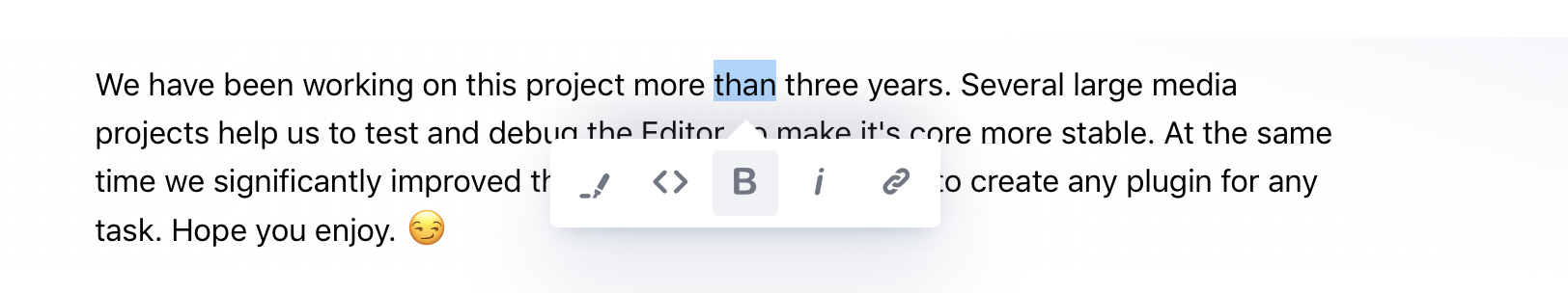
ce-inline-tool
|
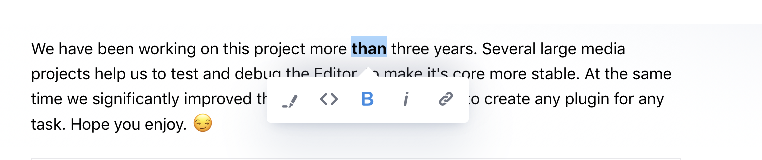
inlineToolButtonActive
|
ce-inline-tool--active
|
Base class for Block Tool wrapper. Provides common margins and paddings between Blocks.
'cdx-block'
Style of buttons for the Inline Toolbar.
'ce-inline-tool'
Modifier for the active state of Inline Toolbar Button.
'ce-inline-tool--active'
A common style for text inputs.
'cdx-input'
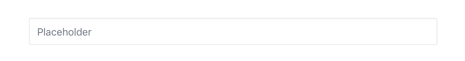
You can set a placeholder for contenteditable element by adding a data-placeholder attribute:
<div contenteditable class="cdx-input" data-placeholder="Custom placeholder">
</div>
Add this class to some element to show an animated loader placed over the element.
'cdx-loader'
A common style for buttons.
'cdx-button'
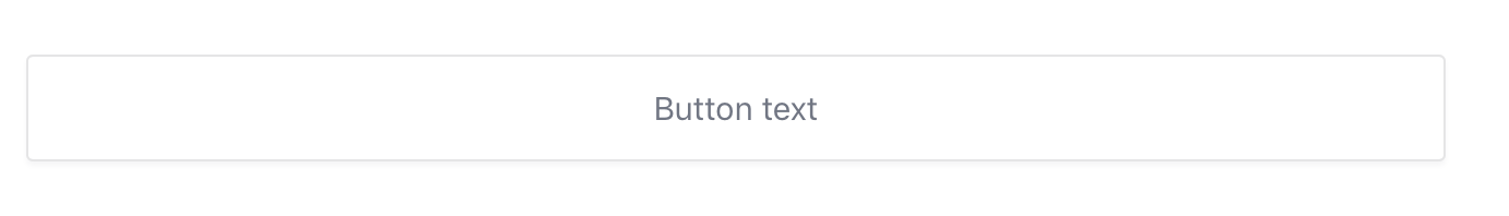
<div class="cdx-button">
Button text
</div>